

From Amphorae to Instagram
A visual journey through 3,000 years of Greek food packaging

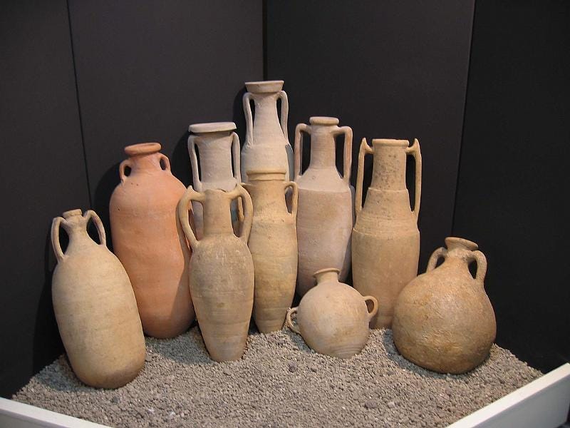
In a backroom of the National Archaeological Museum in Athens, the light is cool and dusty. Ranks of clay jars stand shoulder to shoulder, stamped with owls, dolphins, and city crests. Every one of these is a brand.
The amphora was more than storage; it was communication. Its shape, clay, and stamp told you who made it, where it came from, and what it was worth. In other words, it was the ancient world’s Instagram feed - identity and aspiration in fired earth.
The Greeks were among the first to turn packaging into art. An Athenian potter’s mark wasn’t vanity; it was a promise. The wide-shouldered, narrow-necked Attic amphora announced its contents: olive oil from the sacred moriai groves. The long, lean Corinthian jar implied wine, exotic and spiced. Even the clay’s hue became branding - Attican orange versus Cretan beige, reflecting the soil they derived from.

Amphorae travelled across the Aegean like tagged posts, spreading a visual dialect everyone could read. Consumers recognised a jar from Athens or Rhodes the way we now spot a minimalist olive-oil bottle and assume it’s expensive.
The amphora as influencer
By the 5th century BC, the amphora had evolved into a full storytelling platform. The prize jars given to Panathenaic victors always showed Athena on one side and the contest (running, wrestling, javelin) on the other. Below, the inscription: From Athens.
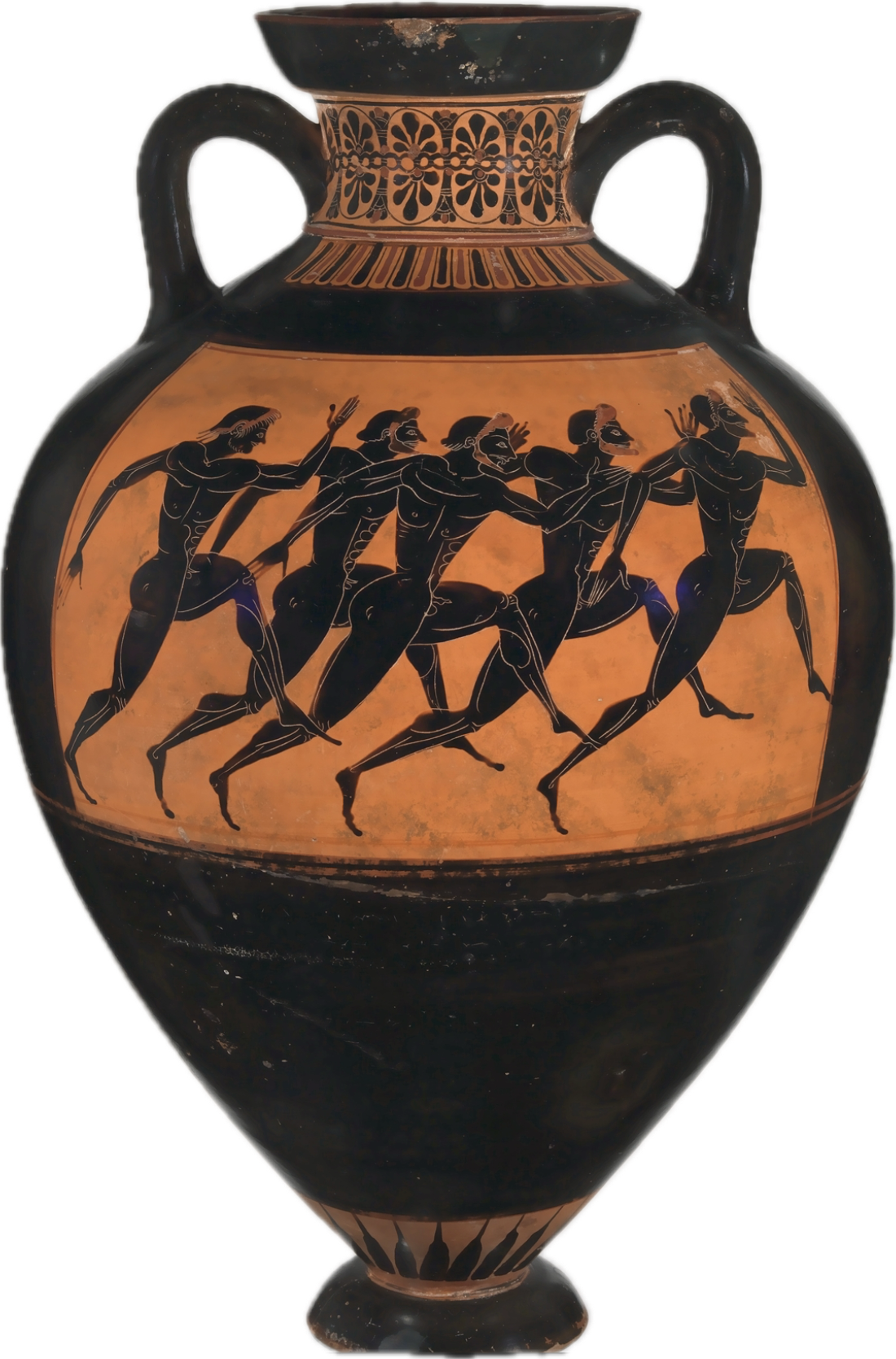
It was divinely endorses civic branding. The jars were so distinctive that traders reused them as status symbols long after the oil was gone. Owning one said you had taste and possibly biceps worth worshipping.
Did You Know?
Global reach: Fragments of Athenian amphorae have been found as far away as southern France and Spain - ancient proof of a pan-Mediterranean distribution network.
Anti-counterfeiting: Some jars had official city seals; potters could be fined for copying them.
Volume control: The amphora became a standard unit of measure (roughly 26 litres) the ancient metric system.
Durability: Archaeologists still use amphora typology to date shipwrecks; each shape is as distinctive as a logo.
The evolution of the Greek label
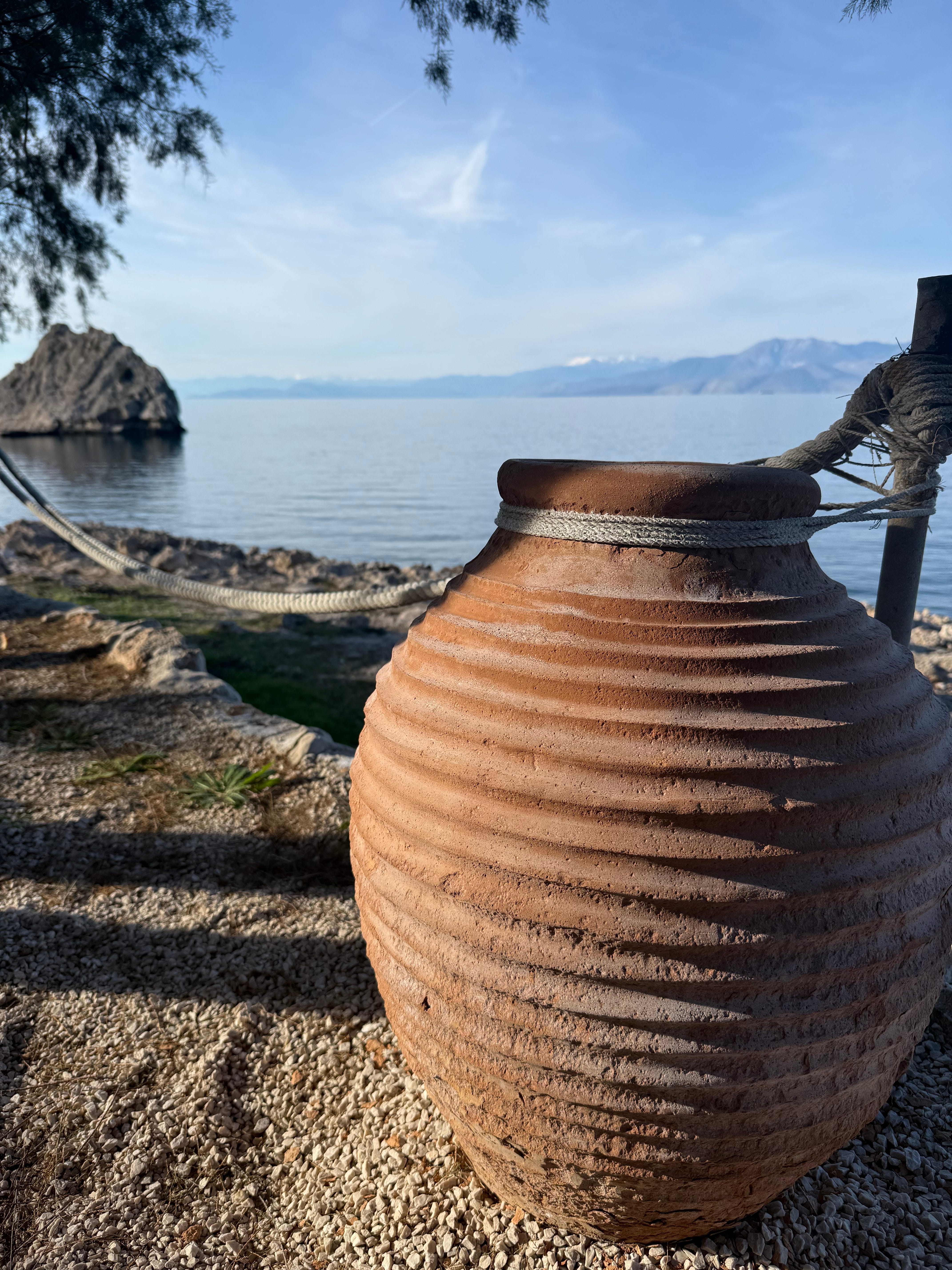
Fast-forward twenty-five centuries. My cousin Ziad and I have recently launched Mount Helikon, a boutique olive-oil brand, that, in its design, reflects the mountain range and terroir our olive trees nestle in. Our friend’s honey brand, Agale, talks (literally) of a slower, simpler attitude to life. A winemaker near our estate adds a QR code linking to drone footage of his vines.
Different mediums, same message: origin equals value. The amphora has gone digital. Instagram, with its filtered light and golden tones, is the new agora where Greeks once traded amphorae under colonnades. The language of trust is still visual.
At a packaging studio in Athens, designer Alex shows us designs for Mount Helikon. “We’re obviously selling olive oil – that has to be clear to people.” he says. “But it also has to be more than that. We’re promoting a tradition rooted in millennia of history, in the dry, rocky red earth that trees grow in, and the blazing sun that ripens every olive. We’re selling a memory and a promise.”
He points to images of olive oil bottles shaped like Cycladic idols and jars patterned after black-figure pottery. “Large amphora had two handles,” he adds. “Easier for you to share the load; and sharing is at the heart of the olive oil experience. Greeks use it communally. At the table with friends and family.”
Packaging as philosophy
Greek packaging has always been about more than aesthetics. It’s a philosophy of presentation: beauty as truth. In antiquity, a well-made jar testified to the honesty of its contents. Today, design still performs that duty - proof that care went into both form and flavour.
In the mid-20th century, as Greece rebuilt after war, packaging became patriotic. Olive-oil tins carried national emblems; honey labels bore slogans of purity and progress. By the 1980s, tourism added its own gloss: sunlit typography, Santorini blues.
Now, minimalism reigns. Modern Greek brands compete not in ornament but restraint - a wink to the ancient ideal of ‘metron ariston’, moderation as beauty.
Did You Know? (Part II)
Byzantine branding: Monasteries once sealed honey jars with wax imprints of saints - the earliest religious trademarks.
Ottoman crossover: 19th-century export tins often used both Greek and Arabic script to reach multiple markets.
Tourism boom: In the 1960s, Greece became one of the first countries to pair national branding with food exports - olives as cultural ambassadors.
Digital amphorae: Blockchain traceability now lets consumers scan a bottle and see its grove coordinates - the amphora reborn in code.
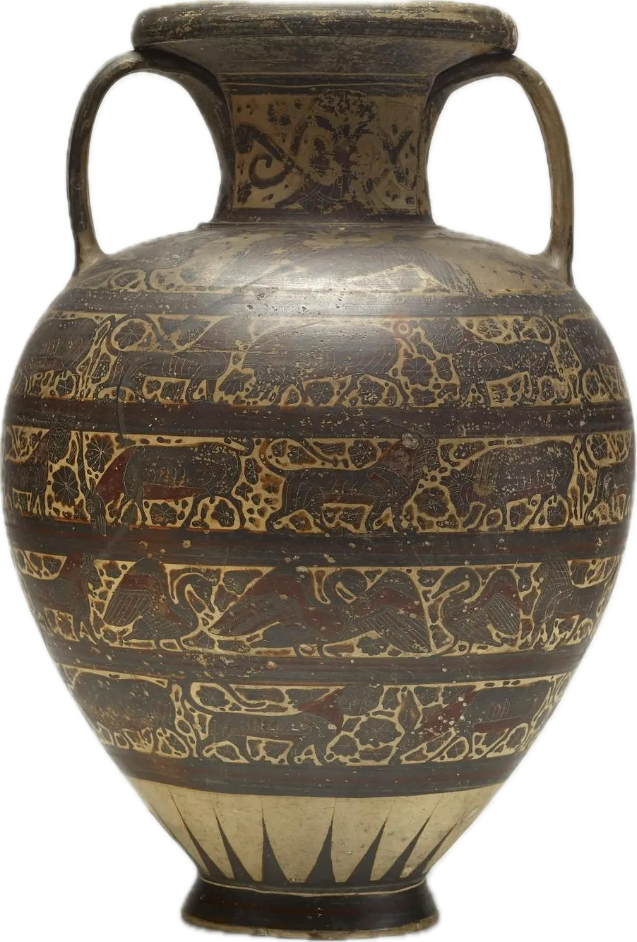
At the Athens Design Museum, the exhibition Greek Brand Stories lines up a millennium of containers: amphorae, Byzantine jars, Ottoman tins, Art Deco labels, minimalist bottles. It’s less a design show than a visual archaeology of desire.
Each vessel answers the same question: Can we make virtue visible?
When you buy a bottle of Cretan olive oil shaped like a tear, you’re really buying an emotion. The amphora promised the same thing in clay.
Scroll through #GreekOliveOil or #ThymeHoney and you’ll see the lineage: glowing jars backlit by sunset, captions quoting Aristotle, hands drizzling amber over white marble. The medium has changed, but the message (purity and provenance) remains untouched.
What began as a potter’s stamp has become a hashtag. What was once stored in clay is now shared in pixels. Yet the story still holds: if you can taste history, you can sell it.
Sources